
I’m writing a series of posts to provide guidance to people who are learning the basics of market research. I’ll be using real-life examples of both great and bad research, analytics, and reporting.
In this first post about reporting survey data, we’ll discuss when it is appropriate to report a Top Box Score (i.e., % of respondents who gave a “5”) or a Top 2 Box Score (i.e, % of respondents who gave a “4” or a “5”)? I’ll use King County’s employee survey as an example of what not to do.
King County conducts an annual employee engagement survey for their approximately 14,000 employees. Below is how they asked the question in 2012.
Q. King County employees are treated with respect, regardless of their race, gender, sexual orientation, gender identity or expression, color, marital status, religion, ancestry, national origin, disability or age. (Using a scale where “1” means “I strongly disagree and “5” means “I strongly agree”.)
Here are the results from their 2012 report (with my mark-ups):
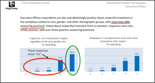
My interpretation of this chart, using a Top Box score, is that 56% of employees are treated with respect but 44% (4 out of every 10 employees) aren’t treated with respect for some reason at work. That is nearly half of all employees! To present the data more positively, as King County did, you might use a Top 2 Box and say: “…more than 90% [answered] positively”. NO. JUST NO. Why?What does it mean when a person responds with a “4” to this question? Does it mean that they are respected at work sometimes? Most of the time? Maybe 75% of the time? Any response to this question that isn’t a “5” should be interpreted as: I am not generally treated with respect.
I was taught the following interpretation for survey results such as this:
- “5” is a yes
- “4” is a polite no
- “3” is a no
- “2” is a firm no
- “1” is a hell no
This is an example of how to mislead the interpretation of results, by making it appear more positive than it really is, by using a Top 2 Box. A Top 2 Box score is often used in market research and can be an appropriate way to view data. For example, Net Promoter uses a Top 2 Box for “promoters”.
Below is the question wording and how King County reported data in 2016 (with my mark-ups):
They are still using Top 2 Box to report these data as “% positive”. I cannot see the frequencies for this question publicly online so I do not know the % who responded “4” versus “5”. As an aside, they have changed survey vendors so the question wording has improved. It used to be 10 questions in one.
Lastly, it seems that King County cares about their employees and being a great place to work. They have been conducting an employee engagement survey since at least 2009. On that note, I hope they are also examining how their employee engagement (or lack of engagement) impacts the results of their customer satisfaction surveys.
It is also apparent that they’ve made the same mistakes that a lot of organizations make and have program/project managers overseeing their surveys but no one who is dedicated to understanding research and its outcomes. It might benefit them to do what is done in the private sector and have a Director of Research. My guess is that research is fragmented among their departments. Each department conducts surveys on their own but there is no one, centralized department with oversight to ensure research methods, analysis, and reporting are sound. You can’t rely on research vendors to do this for you (more on this in a future post).
