I’m writing a series of posts to provide guidance to people who are learning the basics of market research. I’ll be using real-life examples of both great and bad research, analytics, and reporting.
In this first post about reporting survey data, we’ll discuss when it is appropriate to report a Top Box Score (i.e., % of respondents who gave a “5”) or a Top 2 Box Score (i.e, % of respondents who gave a “4” or a “5”)? I’ll use King County’s employee survey as an example of what not to do.
King County conducts an annual employee engagement survey for their approximately 14,000 employees. Below is how they asked the question in 2012.
Q. King County employees are treated with respect, regardless of their race, gender, sexual orientation, gender identity or expression, color, marital status, religion, ancestry, national origin, disability or age. (Using a scale where “1” means “I strongly disagree and “5” means “I strongly agree”.)
Here are the results from their 2012 report (with my mark-ups):
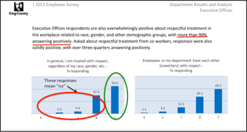
My interpretation of this chart, using a Top Box score, is that 56% of employees are treated with respect but 44% (4 out of every 10 employees) aren’t treated with respect for some reason at work. That is nearly half of all employees! To present the data more positively, as King County did, you might use a Top 2 Box and say: “…more than 90% [answered] positively”. NO. JUST NO. Why? Continue reading