I received a paper survey from the University of Washington Medical Center. It included this question about health care in the last 3 months:
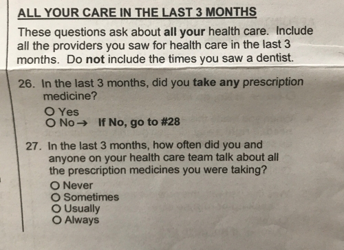

I received a paper survey from the University of Washington Medical Center. It included this question about health care in the last 3 months:
Posted in Uncategorized
I’m writing a series of posts to provide guidance to people who are learning the basics of market research. I’ll be using real-life examples of both great and bad research, analytics, and reporting.
In this first post about reporting survey data, we’ll discuss when it is appropriate to report a Top Box Score (i.e., % of respondents who gave a “5”) or a Top 2 Box Score (i.e, % of respondents who gave a “4” or a “5”)? I’ll use King County’s employee survey as an example of what not to do.
King County conducts an annual employee engagement survey for their approximately 14,000 employees. Below is how they asked the question in 2012.
Q. King County employees are treated with respect, regardless of their race, gender, sexual orientation, gender identity or expression, color, marital status, religion, ancestry, national origin, disability or age. (Using a scale where “1” means “I strongly disagree and “5” means “I strongly agree”.)
Here are the results from their 2012 report (with my mark-ups):
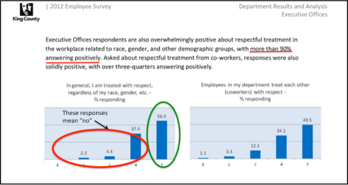
My interpretation of this chart, using a Top Box score, is that 56% of employees are treated with respect but 44% (4 out of every 10 employees) aren’t treated with respect for some reason at work. That is nearly half of all employees! To present the data more positively, as King County did, you might use a Top 2 Box and say: “…more than 90% [answered] positively”. NO. JUST NO. Why? Continue reading
Posted in Employee Engagement, Market Research, Reporting Data, Strategy, Survey Design
Tagged box scores
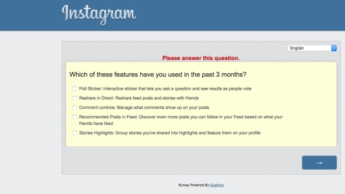
I received a survey from Instagram asking about which features I use. Can you spot the small, meaningful omission in the question below?
One of Jakob Nielsen’s 10 Usability Heuristics concerns user error prevention, and it is perhaps among the most important ones. Having a good design process in place, an understanding of the concept of mental models, and conducting usability tests can uncover potential areas of user error. These can then be addressed through design improvements targeting error prevention.
In The Design of Everyday Things, Don Norman categorizes errors into slips and mistakes. Slips take place at a subconscious level and occur when an action is not done correctly; you intend to do one thing and end up doing something else. Slips also occur during the execution of a plan or in the perception or interpretation of the outcome. Mistakes are conscious deliberations, they “occur when the wrong goal is established or wrong plan is formed”.
Norman further breaks down slips and mistakes into classes. Let’s look at each of these further. Continue reading
Posted in Mental Models, Usability, UX
Tagged categories of errors, don norman, jakob nielsen, mistakes, usability heuristics
Cornell researchers have developed an algorithm that predicts which version of a tweet will be retweeted more. Here are a few of the things they found most likely to generate retweets (to read more or for the full list please click here):
Ask people to share. Words like ”please,” “pls,” “plz” and, of course, “retweet” were common in successful messages.
Imitate the style of newspaper headlines. (In their tests, the researchers used the New York Times as a model.)
Use words that appear often in other retweeted messages.
Use words that express positive or negative sentiment.
Refer to other people, not just yourself. Use third person pronouns.
To test your own tweets, visit their website.

A recent HBR article notes negative comments result in our bodies producing higher levels of cortisol that can last for 26+ hours. Positive comments result in our bodies producing oxytocin but the effect doesn’t last as long so it isn’t as impactful. Unfortunately, managers are using both positive and negative comments thereby confusing their employees and creating more cortisol production.
When we face criticism, rejection or fear, when we feel marginalized or minimized, our bodies produce higher levels of cortisol, a hormone that shuts down the thinking center of our brains and activates conflict aversion and protection behaviors. We become more reactive and sensitive. We often perceive even greater judgment and negativity than actually exists. And these effects can last for 26 hours or more, imprinting the interaction on our memories and magnifying the impact it has on our future behavior. Cortisol functions like a sustained-release tablet – the more we ruminate about our fear, the longer the impact.
Positive comments and conversations produce a chemical reaction too. They spur the production of oxytocin, a feel-good hormone that elevates our ability to communicate, collaborate and trust others by activating networks in our prefrontal cortex. But oxytocin metabolizes more quickly than cortisol, so its effects are less dramatic and long-lasting.
Survey questions with context ambiguities are usually a sign that the researcher either doesn’t understand the context the respondent might draw upon when answering the question or the context within which the company might use the data. One way to address both kinds of context ambiguity is through cognitive interviewing: having test respondents thinkaloud while they answer survey questions. The interviews help ensure respondents are interpreting questions the way researchers intended and also that they are measuring what they intended. Here’s an example that shows why cognitive interviews are usually a good idea. It is from a survey asking about a large multinational bank.

Personally, my life’s dreams can’t be achieved through “prioritizing financial goals”. They in fact, aren’t related to financial goals and that is not the fault of this bank. Continue reading
Posted in Market Research, Survey Design
Tagged cognitive interviews, context, think aloud
Interior Designer Rose Tarlow is very particular when it comes to sofas, “I never use two seat cushions because three people won’t sit on the sofa…”
I didn’t give it too much thought until I ended up with this sofa:

Notice it has ONE cushion. The design offers two affordances: the choice of where to sit and the number of people who can sit. By contrast a traditional three-cushion sofa constrains those choices. A two-cushion sofa offers ambiguous cues on how many can sit and where they can sit.
In the Design of Everyday Things, Don Norman said;
“…the appearance of the device must provide the critical clues required for its proper operation—knowledge has to be both in the head and in the world”.
So judging by this principle, single cushion sofas are better than three and two-cushion sofas. Though of course those sofas have different affordances like easier clean-ability.
Productivity and time management apps have been huge on smartphones in the last few years, and as a big fan of any kind of list-making or diary tool, I really enjoy playing with such apps. One of the most interesting ones out there is Lift, an app for goal-setting.

During a class I took last fall at UW, I got a chance to dive in and do some user research on it with a team, so I thought I’d do a little blog post about that.
Posted in Usability
Tagged grounded theory, HCDE, teamwork, think aloud, user research
The Pew Research Internet Project recently tweeted about an article about social media usage and age groups. It included the chart below that shows there is a generally upward trend (since 2006), which might be flattening, in social media usage across all age groups. Whenever I see a chart on age and something technology related, I always wonder if there is increasing adoption of the technology among the older age groups or if folks are merely aging into a higher age group.

Posted in General, Market Research
Tagged age effect, data analysis, social media usage
